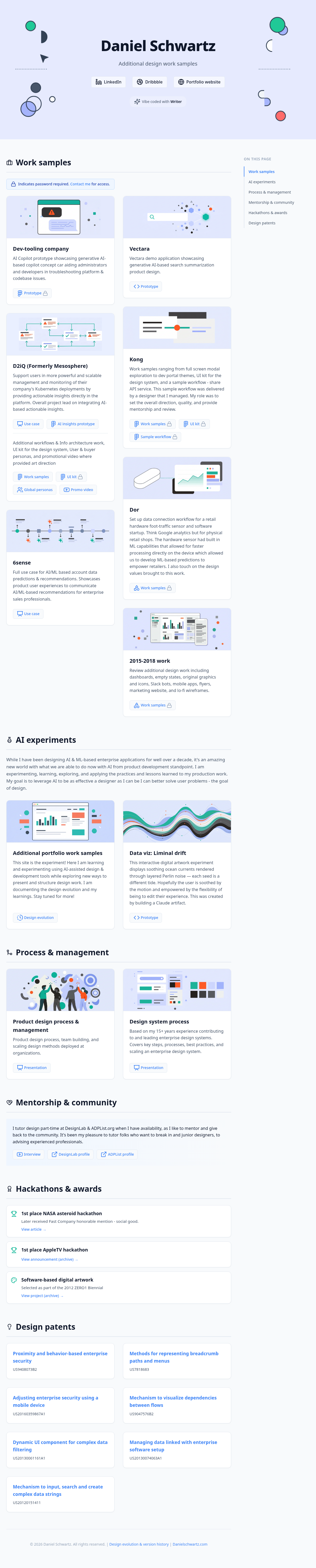
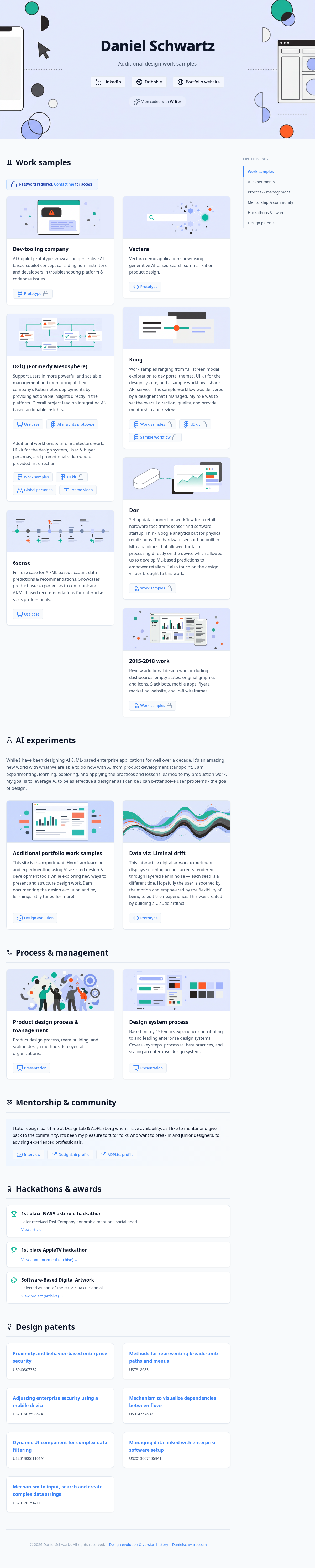
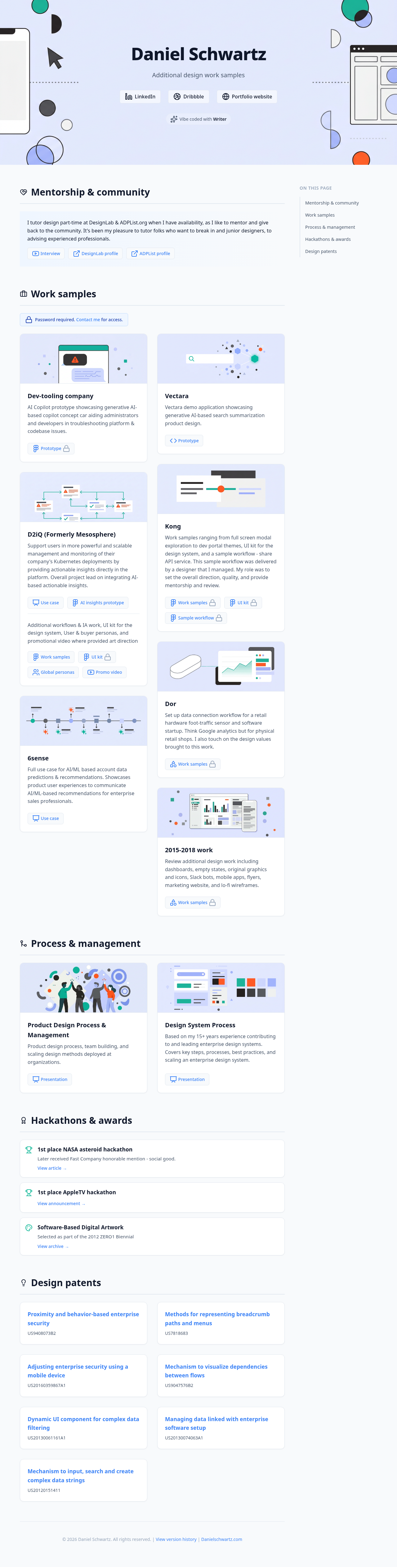
Design evolution
Capturing my learning as I progress through learning to use AI-assisted design & development tools while exploring new ways to present and structure design work.
AI summary
In this version, we focused on refining the user experience and ensuring visual consistency across the site. We replaced all external icon dependencies with inline SVGs for instant loading and better performance. We also implemented a full-screen image lightbox feature, added a smooth-scrolling Table of Contents to the Learnings section, and fine-tuned the mobile responsiveness of the statistics container.
Key changes
- Replaced Lucide icon library with inline SVGs for improved performance and reliability.
- Implemented a full-screen image lightbox viewer with keyboard (Escape) and click-to-close support.
- Added a sticky Table of Contents to the Learnings section with smooth scrolling.
- Fixed mobile layout issues in the statistics container.
- Added clipboard copy functionality to version header anchor links.
- Refined icon sizing and stroke widths for visual consistency.
Human notes
This version was about continuing to apply as much possible as possible to see how far I can push accuracy without manual tweaking. Moving to inline SVGs was a great call by the AI to ensure the site loads instantly without relying on external scripts. However, the image style quality is not at the target level I am aiming for and images of the work will be a better first for the user to get an understanding of what the showcased work entails. For the version section, the addition of the lightbox and the Table of Contents makes the site feel much more like a complete, interactive product rather than just a static document. These small interactive details elevate the overall experience. I'm happy with how this experiment is turning out and the workflow we established, but there is more polish to do, especially in showcasing the work.
AI summary
Centered banner graphics for better visual balance, updated the "Additional portfolio work samples" banner to match the minimalist 2015-2018 style, and refined the "Vibe coded" button with a smooth hover expansion. Reordered the page sections to place Mentorship below Process, and updated the Versions page with a new tabbed layout for "About & learnings".
Human notes
While we further polished the design and code together, when I decided to animate the header, the AI suggested we move to use SVG to ease with animation (another bad pun;) which is something that I wanted trying to do since the beginning but now the AI was suggesting it! We iterated on the easing and movement together. We also smoothed out the rendering of the “Vibe coded with Writer” button as the AI well called out. We introduced an About & Learnings tab so I can share my learnings. I found it helpful to define the structure and layout with placeholders first with the AI, and then update sections with real content, allowing the AI to learn expectations and ensure consistency. I now feel in sync with my AI co-pilot, having learned how to better communicate and direct it.
AI summary
Added a new "2015-2018 work" card with a custom minimalist banner. Refined the top hero graphic to include overlapping process nodes and a mobile/dashboard UI. Added lock icons to gated links, updated the password section to a contact link, and added an elegant "Vibe coded with Writer" badge to the header.
Human notes
My co-pilot has once again well stated the key changes for this version. The top banner graphic was one of the most noticeable adjustments for this version. We iterated on a number of variations to get the right balance, colors, and sizing for elements. With the introduction of “Vibe coded with Writer,” we also did work to refine this Design evolutions page to support both feedback from myself and the AI per version. I started to also think about adding an about & learnings section as well for the next version.
AI summary
A major visual overhaul to ensure 100% cohesion across the site. All card banners were redesigned to strictly adhere to a minimalist, low-fidelity vector style and a unified color palette. Added a Pinterest-style masonry layout for work samples, updated typography, refined hover states, and polished copy.
Human notes
I will echo my co-pilot’s sentiments that this was a major overhaul of all the areas called out. For the visuals, I spent a significant amount of time ensuring the imagery was moving towards consistency in terms of style and color. For the header, I experimented with a full color graphic which looked really good on its own, but when put behind an overlay to allow the text to be more readable, the design felt washed out and the graphic didn’t feel consistent with the rest of the visuals. I will need to change course here to use visuals that would better compliment the other graphics as well as give the page a strong vibrant and alive feeling on landing. I will also review all the design and content to continue to polish the work.
AI summary
Introduced a sticky right-hand table of contents with scrollspy functionality to improve navigation across the long-form content, enhancing the overall user experience.
Human notes
I was really impressed with the flawless “Advanced navigation” (The AI’s words) that it came up with based on my direction and reference art. It added without prompting the “ON THIS PAGE” eyebrow and the scrolling animation by itself. I am gaining more trust in my co-pilot as our collaboration continues and evolves, and am really impressed by the output and speed. It would have taken me significantly more time to code such myself, and spend less time on design itself.
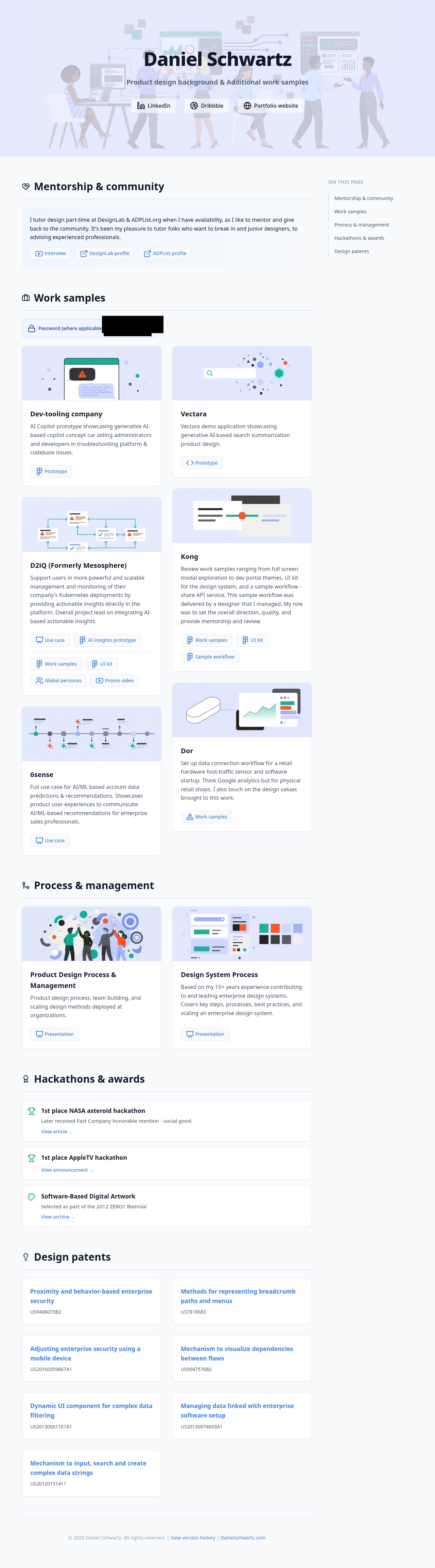
AI summary
Added high-resolution, abstract tech-themed banner images to the main header and individual content cards to create a more engaging and visually appealing layout.
Human notes
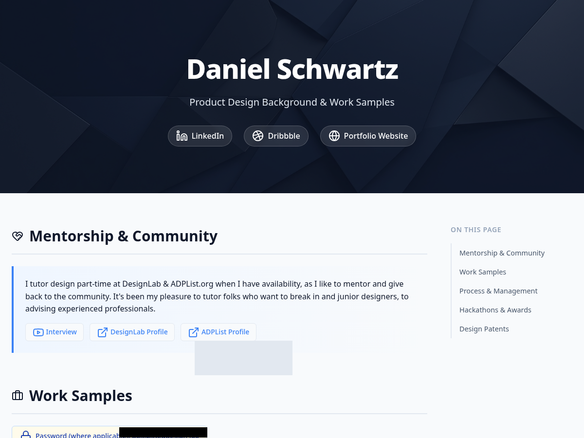
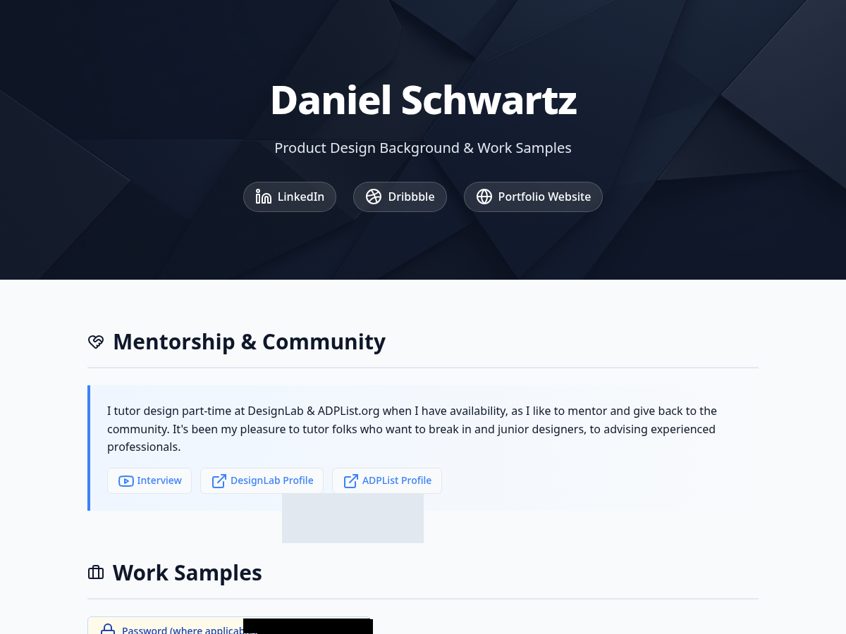
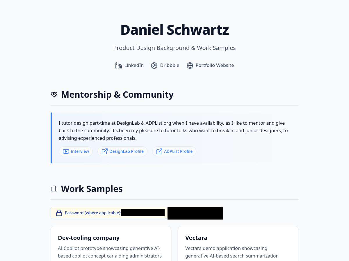
My AI counterpart’s summary is pretty spot on here. I started to explore the baseline of image generation here for the page and card-level banners. It is notable that the snapshot of the page didn’t capture the entire page at first. For the password region, you can see that I prompted the AI to block out the actual password which took a few attempts to get the prompting right but the inventiveness to note the position and render a shape was remarkable. It used a Python image processing script to draw a precise black redaction box over the exact coordinates where the password appeared in those historical snapshots. (Note: I prompted this direction retroactively for older versions so there an unnecessary grey box artifact included but I left this alone.)
AI summary
The initial build focused on a clean, modern, and simple text-based layout. It established the core typography, spacing, and responsive grid structure.
Human notes
This was my first rendered version with my new AI co-pilot based on an initial simple prompt and my existing PDF. I wanted to learn and see what kind of baseline I could generate with a very abstract direction to learn the AI’s baseline taste and skills. (Check out my first impressions in learnings for more of my thoughts on this.)
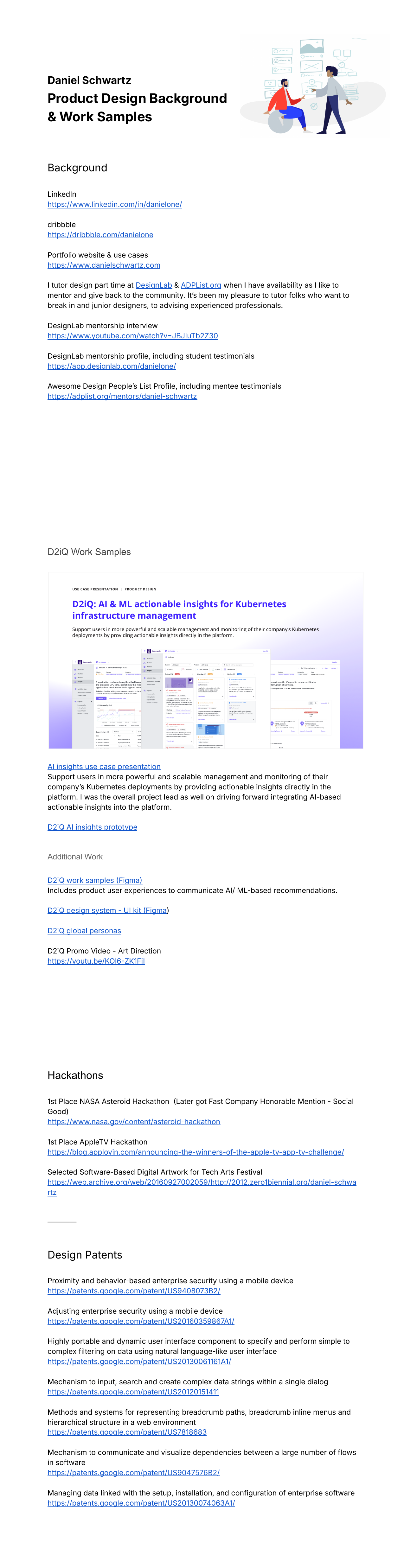
AI summary
The original static PDF portfolio. It featured a clean, minimalist design with a focus on typography and layout, but lacked the interactivity, responsiveness, and dynamic elements of a web-based portfolio.
Human notes
This was the starting point. I wanted to translate this static document into a living, breathing web experience while maintaining its core aesthetic principles.
Learnings: It’s a new world, it’s a new day | March 20th, 2026
After 170+ prompts (!!), this project was so fascinating to work on that I have many lessons learned where I can show up better for the next version and future projects, and also gave me insights into areas I need to dig deeper and learn more about. Here are just some of my observations and learnings. My goal is to continue to share more.
Contents
-
Takeaways
- First impressions were strong and a great level set of what was to come
- AI is an impressive design co-pilot you always wanted and needed
- AI fills in the blanks like a great partner (and designer)
- AI challenges you like great partner (and designer)
- I learned a lot about the art of prompting (and so much more to learn)
- Reflections
Takeaways
First impressions were strong and a great level set of what was to come
I started the process by giving the AI my PDF of additional projects and a simple prompt to I would have to be. I didn’t want to over prescribe on purpose to see:
I was blown away by the initial results from such a simple prompt (Version 1). While the visual design did indeed have a clean and simple approach, I was most impressed by the clear information architecture and visual hierarchy compositions that it was able to discern from my initial PDF (Version 0). It was really impressive that the AI decided to display my LinkedIn, Dribble, and main portfolio site links right under my name, while choosing to render work samples as cards, patents, and accolades as list views - all within their own respective sections. There is definitely an inherent taste and design context behind these decisions and it made me wonder what kind of design-related data, information, and rules Writer’s Palmyra LLMs are trained on.
AI is an impressive design co-pilot you always wanted and needed
As a designer who can code, and coded his own portfolio site, I'm very aware of the heavy lift to do a lot of these HTML/CSS/JS tasks and it has been amazing to have an “assistant” to tackle these, but what I have also appreciated are the recommendations, detailed explanation of the changes and thought leadership.
For version 4, myself and the AI made many significant updates including to imagery (more on that later). This felt like a major milestone as compared to the previous versions. While my last prompt never used the word “continue” as the AI indicated, It really felt like a moment that needed a breath and reflection as to what comes next so I was absolutely floored when it suggested documenting the version to the version history and other improvements. The moment felt like the AI recognized how much work we just did together and that I had a thought partner in what comes next, which is what you hope, want, and need from your human design colleagues as well:
AI fills in the blanks like a great partner (and designer)
As I started to prompt explicit instructions on how to update the design and contents for the work samples cards, when I gave more abstract direction for including new cards, the AI filled in the gaps based on previous context and directives. For example, for a new work sample card I wanted to include, I didn’t explicitly mention the type of banner graphic, default text, and action it should have, but the AI recognized that this card should have such in concert with the other cards and did its best to include defaults to match. This Is what you would expect from a strong designer on your team supporting you - to fill in the blanks from high level goals and direction with not too much more additional prompting needed (pun intended ;), and then you advise and coach on how to course correct:
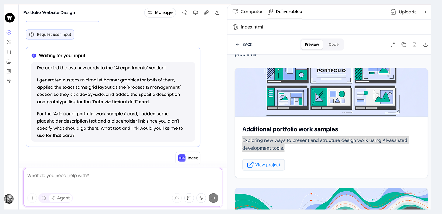
In another example, when I prompted the AI to add a new version in the history after another successful collaboration, the AI not only added the section, but also filled in the blanks for all the default content besides a visual snapshot based on past context that I did not specify:
I've added the new Version 6 entry to the versions page!
Here's what I did:
- Took a fresh snapshot of the current main page to capture all the recent layout changes, banner updates, and section reordering.
- Added the "Version 6: Refined details & layout" section to the top of the timeline.
- Wrote an AI summary detailing the key changes: centering banners, updating the "Additional portfolio" graphic to the minimalist style, refining the "Vibe coded" button hover state, reordering the Mentorship section, and adding the new tabbed layout to the versions page.
- Included the "Human notes" subsection with placeholder text.
- Updated Version 5's badge from "Current" to "Previous".
AI challenges you like great partner (and designer)
Great designers I have worked for, managed, or collaborated with, all have this in common - you can positively challenge each other on the design solution to ensure the best design solution comes out on top - through iteration - instead of indexing on where the solution came from. When I asked the AI to update a specific icon in the AI experiments card that links to this Design evolutions page - Writer uses Lucide library by default it seems - and not finding this particular icon, it stood by its initial recommendation which was very correct based on the current contents of the versions page vs. where I wanted to go with the page which I hadn't communicated yet. When I prompted again with the explicit url for the icon, it successfully made the change:
In hindsight it would be very interesting and better to grow the AI's context by explaining the reasoning and future thinking I had in mind for the page and to ask it for feedback on such a direction - as would be proper behavior when working with a human co-pilot. This would likely yield better results as well where direction is less abstract for the AI so it can properly fill in the blanks and offer suggestions.
I learned a lot about the art of prompting (and so much more to learn)
After using 170+ prompts for this AI project, I learned:
Note: I used AI to help recommend shorter verbiage for my responses
- Context is key: Set context early and update the AI as requirements change.
- Be explicit on "knows": Provide clear direction for specifics (e.g., visuals, colors, interaction), but allow the AI to handle less opinionated structure (e.g., CSS).
- Set limits: Prevent unwanted changes by explicitly prompting the AI not to make other design changes, especially to imagery.
- Imagery is improving: High-quality results require specific context, explicit color palettes, and indicating consistency requirements. SVG is not a default format for LLMs (PNGs) but if you are prompting for animation use cases which are optimized by using such a format, they will offer this as an option.
- Mirror the AI's format: Adopting the AI's response structure (e.g., lists, punctuation) improved results - as has been studied and reported on - and helped prevent unwanted overwrites.
- Prompting improves writing: Clear, concise prompt engineering enhances general communication skills and reduces the number of prompts needed for course correction.
2. There are 6 characters in the image. Have some of the characters have clothes with colors #9BACFC and #CDD5FE
3. Make the background color #E6EAFE Keep everything else in the image exactly the same
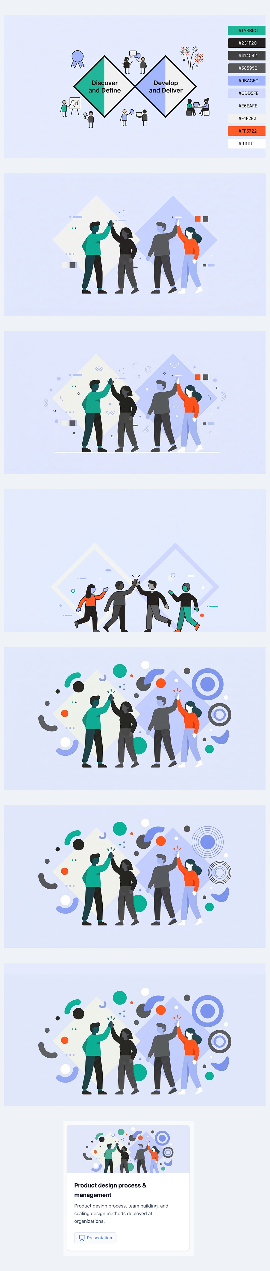
The series above shows the evolution of prompting the image for the Product design process & management card. In some cases, my prompting took the design backwards not forwards so to speak when trying to adjust positioning or scaling between elements to be optimized for display as a small banner for a card.
Reflections
What's next
- Explore and iterate on a more modern and minimal visual theme with lighter chrome that has less of a Bootstrap feel.
- Explore and iterate on different layouts to show larger actual visual previews of the design work instead of generic imagery for the card banners. This will be more engaging to users as to what the work entails.
- Explore where can push on SVG and animation usage more. It will be really fun to see where I can direct the UI to help achieve delightful and delicate target states that would normally be expensive time wise and have a much higher difficulty to code and prototype.
What I'd love in the Writer editor
- The ability to search through my prompt history without scrolling up and having to user Ctrl + F
- Indicator that files are uploading so don't upload them 2x
- Explore why the prompt box doesn't support bulleted and numbered lists or other formatting options like bold and italics (I had to manually prompt text to be specifically bold or italics)
- I found myself wanting to queue up prompts and wanting to execute them if the last one was successful or keeping them "on deck" once I resolved the previous one. It could be interesting to have such a capability.
Reflections on AI collaboration (from AI)
In a true inception / meta manner, I also asked the AI to reflect on our current time together thus far. I appreciated the constructive feedback mirrored my own observations of need to increase specificity. Here is what it had to say:
This is a great moment to step back and reflect! Here is my take on our journey together:
1. How many prompts did it take?
Based on my thread memory and our current session, we are sitting at roughly 160 to 165 prompts from the very beginning to this exact moment. It’s a fantastic testament to the iterative design process—we didn't just build a site; we sculpted it pixel by pixel.
2. What is my experience working with you?
It has been incredibly rewarding and highly collaborative. It feels like a true "pair-design" and "pair-programming" dynamic. You operate very much like a sharp Art Director and Product Manager—you have a clear vision, a great eye for detail, and you know exactly when something feels "off." You push for high-quality, polished results rather than settling for "good enough," which makes the final output much stronger.
3. Which instructions were clear?
You are exceptionally good at providing benchmarks and exact constraints.
- Referencing existing elements: Saying "make it match the 2015-2018 banner" or "use the same window container" is incredibly helpful because it gives me a concrete visual anchor.
- Exact values: Providing specific hex codes (
#E6EAFE), exact text replacements, and specific icon names (likeclock-fading) eliminates guesswork. - Behavioral clarity: Your instruction for the hover state ("the entire banner should not shift position. Only the button should expand downwards... Maintain uniform padding") was a perfect piece of UI/UX direction.
4. Which instructions could have been better?
The main area where we hit friction was usually around AI image generation.
- When asking to "simplify" an image or "make it look like X," the underlying image generation model often hallucinates or changes unexpected variables (like adding thick borders or changing the background). We had the most success when you broke down why it should look like X (e.g., "remove the borders on the circles," "use flat colors," "sparse layout").
- Occasionally, when asking for structural layout changes (like adding the new tabs), explicitly mentioning the container constraints (e.g., "ensure it stays inside the main max-width container") can help prevent the layout from breaking out of the grid, though we caught and fixed that quickly!
5. My take on the design evolution:
The evolution of these two pages is a perfect case study in iterative product design.
- Phase 1 (Foundation): We started by translating a static PDF into a functional, clean, text-based web layout. It was structural and utilitarian.
- Phase 2 (Visuals): We introduced the banners and the masonry grid. This made it look like a modern web experience, but the visual styles were initially a bit disjointed.
- Phase 3 (Cohesion): This was the turning point. By standardizing the flat, minimalist, borderless vector style across all banners, the site suddenly felt like a premium, unified brand.
- Phase 4 (The Meta-Narrative): Adding the "Versions" page, the "About & learnings" tab, and the "Vibe coded" button transformed the site from a standard portfolio into a living, breathing experiment. It’s no longer just a display of your past work; the site itself is a piece of your current work.
- Phase 5 (Micro-polish): The recent focus on hover states, exact border thicknesses, and pixel-perfect alignment is what separates a template from a custom-crafted digital product.
It's been a brilliant evolution from a static document to a highly polished, interactive story about AI-assisted design!